
This project was difficult for me because I rarely use sharpie. But I feel like I did well. I created depth by using repeating lines, using small and large lines, and using dots. I tried to bridge organic and geometric elements ot give the piece an interesting look. Both curved/natural lines and sharp/geometric lines are coming together. I drew a little inspiration from Polynesian/tribal tattoos. This helped me create a few patterns and lines.


This project was fun for me. Transitional projects always engage my imagination. Morphing things is alwas fun. I think my transitions were good. The most geometric square has very clean lines and edges. People said I had interesting shapes used in my composition. There were a few things that I could have improved on. I didn't activate the negative space properly. My sharpie kept drying out, making the work look messy/not filled in completely.


This project was not exciting for me. The objective was to use four squares and one circle to describe different principles of design. For me to describe words with simple shapes was very challenging. I felt a little rushed, so my craft is not the best in these. Overall, I didn't like this project.


I really liked this project. I have always liked the idea of taking something from nature and making it into an abstract piece. I'm proud of what I came up with. The first two abstractions are very different, but also clearly reference the plant. I made the reconstruction with the second abstraction. The reconstruction appears to look creature like, and my idea was that plants in nature can come to life.
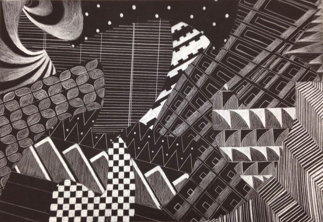
The objective of this project was to use patterns inside template shapes in order to create an overlapping effect without creating a focal point. I used white colored pencil on black paper. This project was enjoyable. I could have improved my craft a little bit, but I think I completed the objective.
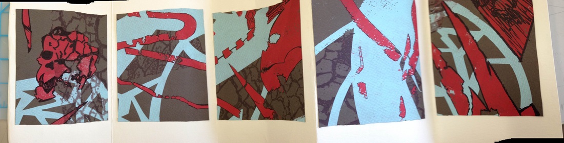
This project was very interesting and exciting. I took a screen print composition, cut it into five different pieces that had their own compositions, and went in with a MICRON pen to add to the composition. I then placed the compositions on a piece of paper and made a booklet out of it. I really liked this project because the compositions that I chose almost tell a story. I saw right away skulls and skeletal like objects and ran with it.
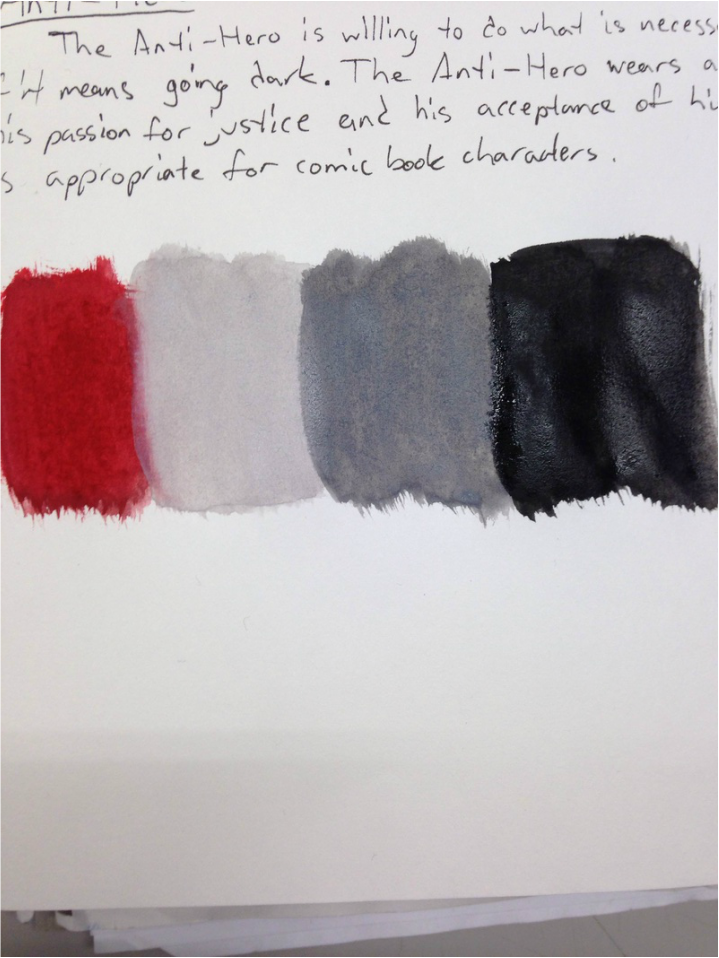
'The Anti-Hero is willing to do what is necessary for the good of the people, even if it means going dark. The Anti-Hero wears an outfit that symbolizes both his passion for justice and his acceptance of his darker deeds. This color scheme is appropriate
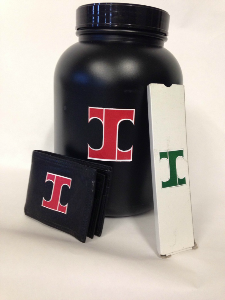
This project involved creating a logo and placing it onto various products. The logo had to represent me in some way, so I decided to go with a combination of my initials. This project was fun in the end because I was able to see what it would be like if my idea was on various products.
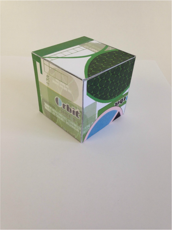
This project was fun. I re-branded a pack of Orbit gum onto a box. I used photoshop to create a design that flowed from one side to the next.
